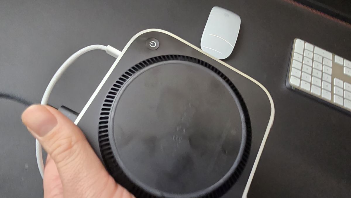
- The new M4 Mac mini’s power button is placed underneath the chassis
- It’s not the only strange design choice made by Apple recently
- Apple VP Greg Joswiak states that it’s due to the reduced size of the Mac mini
The new M4 Mac mini will be Apple’s smallest Mac ever and wields plenty of power, but not without a few odd design choices – and one that seems to have particularly upset some users is that the power button has been moved to the bottom of the tiny PC.
However, Apple seems ready to defend its decision. As noted by IT Home (in Chinese), a video posted on the Chinese social media platform Bilibili shows Apple’s VP Greg Joswiak address the matter when questioned, revealing the reasoning behind the design choice – it was simply down to the reduced size of the Mac mini and the idea that “you pretty much never use the power button on your Mac”.
Joswiak also said “I can’t remember the last time I turned on my Mac,” which suggests that Apple’s official position is that most users should leave the system in sleep mode instead. While this is certainly an option for Mac mini owners, it may not sit well with some users (especially considering most traditional desktop PCs and their prominent power button positions).
Will this impact the M4 Mac mini in any capacity?
There’s no doubt that the new placement of the power button is a bit of an odd choice, and we noted as much in our M4 Mac mini review, but it’s nowhere near as strange as what we’ve seen with the new Magic Mouse’s charging port still on the bottom and brand-new M4 Macs omitting Wi-Fi 7. Besides a minor change to how you power on your M4 Mac mini, this shouldn’t impact your experience in any significant manner.
Considering the reduction of the Mac mini’s size coming from the 2023 M2 chip version, this seems to be a small but worthy sacrifice – if placing the power button in a more convenient area meant losing out on the smallest Mac ever, then I stand by Apple’s decision here.
Despite this, I must say that leaving your Mac mini (or any of the best computers, for that matter) in sleep mode constantly probably isn’t the best idea – while it may be more convenient to dive right back into your tasks, it isn’t ideal for saving power (even if it isn’t using much in sleep mode) and periodically shutting down and restarting your devices is good for their performance as it enables you to apply any updates and refreshes your system cache.
While some of the design choices made in the new Mac mini may be worthy of scratching your head at, the power that the M4 chip provides in performance across the board and a price tag starting at just $599 (£599 / AU$999) still leaves this being one of the best Macs ever made.

