Samsung has finally released the first One UI 7.0 beta update. The update is currently available for the Galaxy S24 series in select countries.
It brings a refreshed UI design, improved privacy and security options, and new Galaxy AI features. The visual redesign includes new app icons for Samsung’s stock apps, and here is how they compare against One UI 6.1.1 app icons.
One UI 7.0 stock app icons vs. One UI 6.1.1
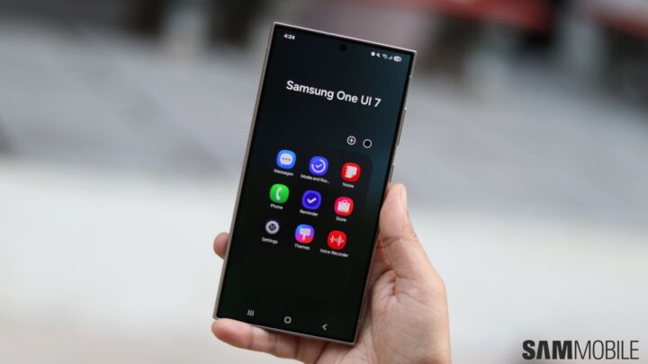
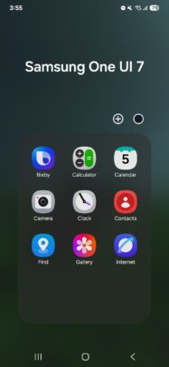
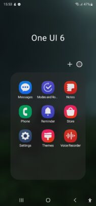
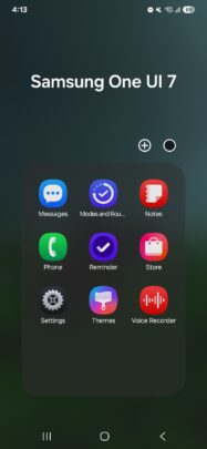
All the stock app icons in One UI 7.0 have a slightly newer design, featuring slightly darker colors with a gradient background. As you can see in the images below, app icons of Calculator, Calendar, Camera, Clock, Reminders, Settings, and Themes have received major changes.
Bixby, Contacts, Samsung Find, Modes & Routines, Samsung Notes, Phone, Samsung Store, and Voice Recorder have received minor changes. The Samsung Messages app icon hasn’t received any change with One UI 7.0, probably because Samsung is in the process of phasing it out in favor of Google Messages.
Inside most of these apps, Samsung has implemented an improved UI design language. Instead of using just text, Samsung has assigned an icon for each tab in the app. That makes it more visually appealing and easier to understand.
Do you like the new stock app icons that have been introduced with One UI 7.0? Let us know by commenting on our social media channels.


