Be sure to cast your votes in the poll below; but first, let’s check out the box art designs themselves.
North America
If there’s one thing that differentiates North America’s version of Hatris, it’s colour. Or the lack of colour, rather. It’s a curious setup, really, as the title itself is kind of tucked away at the top of the composition, while the rest of the image is made up of different hats against a tiled background. Admittedly, it’s a strong showcase for the actual gameplay in Hatris, mind you.
Japan

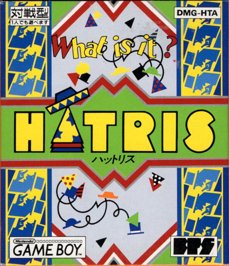
Japan’s approach is a lot more colourful, and we dig it. It’s one of those images where, at first glance, it appears as though there are only a couple of hats, but then you see another, and another, and another, until they’re everywhere. Very cool stuff.
Thanks for voting! We’ll see you next time for another round of Box Art Brawl.


