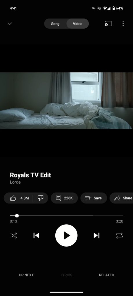
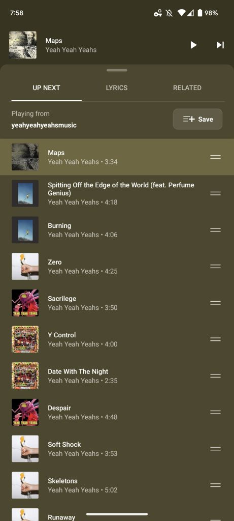
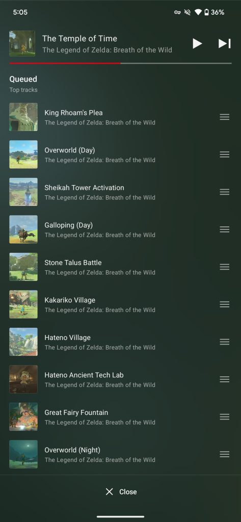
Nintendo Music was announced today as an Android and iOS app that lets you “enjoy some Nintendo tunes,” but the UI looks a lot like YouTube Music over the years.
YouTube Music redesigned its mobile album page in 2023. The original design that was in place for several years is on the left and the Nintendo Music version is on the right:


YouTube Music vs. Nintendo Music
The cover art and the album/collection name is in the same place, while the button placement for saving to library/starring, downloading, and even the three dot menu is identical. Then there’s the pill-shaped “Play” and “Shuffle” buttons just below that.
Nintendo Music is using a very similar miniplayer, which YouTube Music moved away from last year. Meanwhile, the bottom bar is organized the same way with “Home” first and “My Music”/Library last. How Nintendo Music uses “Search” as basically as an Explore page is pretty similar to Google’s app.
Home in Nintendo Music is a series of carousels, like YouTube Music:


The Library tab is also structured like the current YTM UI with a grid layout and chips at the top, like “Downloaded.”


The Now Playing screen has the same play/pause and next/last arrangement flanked by shuffle and repeat in identical positions, while the red progress bar is above it. The queue button is different, but is also located in the bottom-left corner position like “Up next.” Since Nintendo Music shows rectangular cover art, it looks a lot like the video player in YouTube Music.


Finally, the overflow menu shows the same long list with a preview at the top.
Nintendo Music is available today on Android and iOS for Nintendo Switch Online members.


FTC: We use income earning auto affiliate links. More.

