So… The Pixel 6 Pro set a high bar for aesthetic design for me, which means every new phone coming out has to be at least as good looking in order to get my seal of approval.
At the same time, big phone makers (save for Google) seem to be going in the opposite direction, and the latest example of that is the most recent iPhone 16 leak, which shows us Apple’s upcoming vanilla flagship in five colors.
And where do I begin…
Leaked iPhone 16 colors look uninspiring: Will Apple ever find the right shade of blue and green?
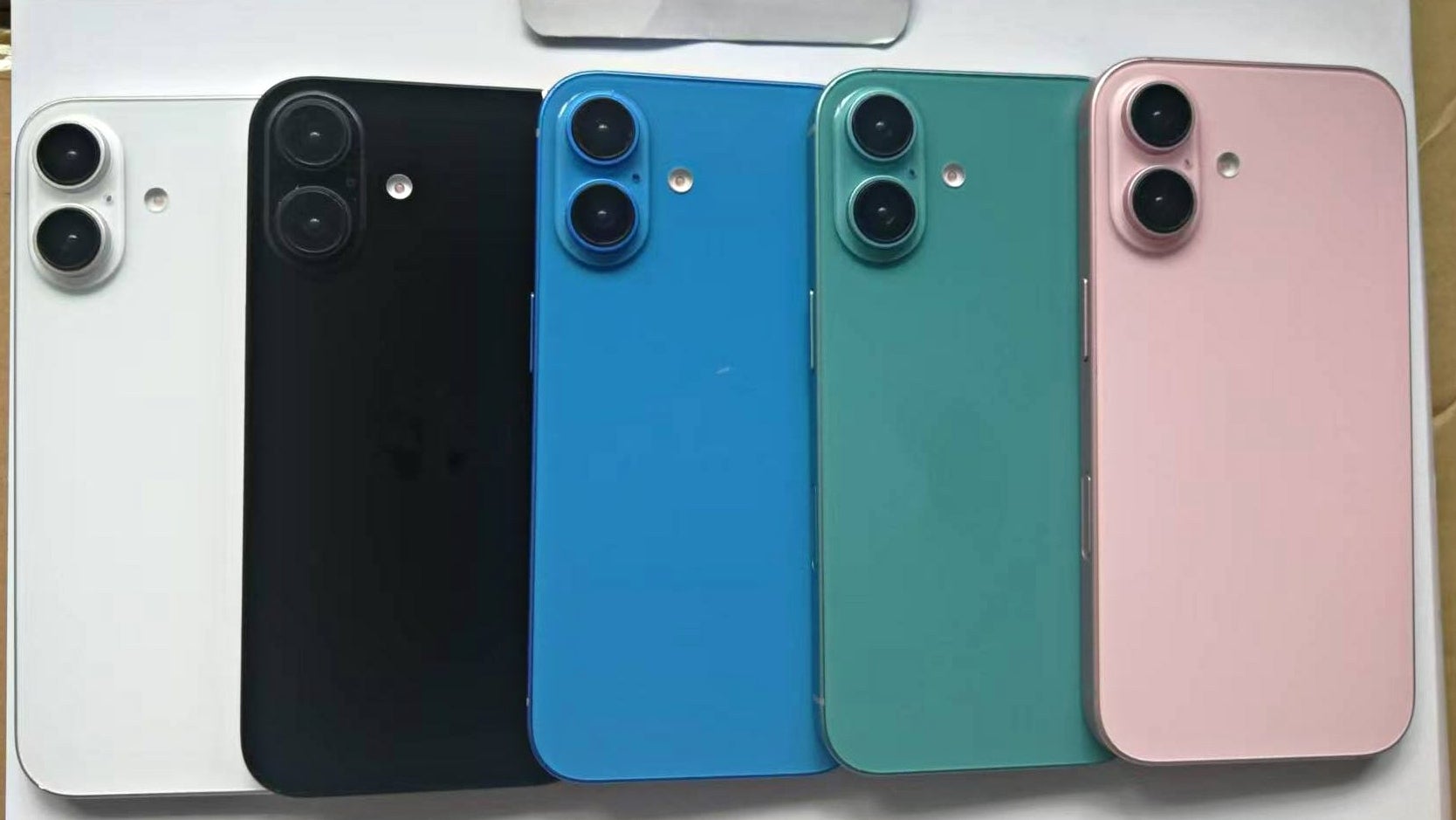
Leaked iPhone 16 dummies.
To be clear, we’re looking at iPhone 16 dummies, so there’s a chance the final colors/shades we get in September might vary.
Bear in mind that Apple might still apply the special technology, where the colors of the iPhone 16 are “infused” into the rear glass, which could end up making the colors you see here far more muted, and… different.
That being said, I find the (alleged) new color selection for the iPhone 16 to be incredibly uninspiring, and if these are indeed the final colors, I can’t see myself buying a new iPhone 16 (without putting it in a case).
Where’s the color variety, Apple?
I get it – Tim Cook & Co rely on market research and sales numbers when it comes to picking the new iPhone colors, but this isn’t exactly like the “one size fits all” solution that works so well with iPhone displays. Colors are a matter of taste…
I was amongst the first phone nerds to complain about the washed out colors of the iPhone 15 lineup when it came out, but when I said “Apple should use a bit more paint”, this isn’t what I meant at all.
The iPhone 16’s colors seem to have done a full 180, and now they look rich but due to the bizarre shades, they also look uninspiring, and just… not fun.
Alleged blue and green iPhone 16 don’t look as stylish as the blue iPhone 12 and iPhone 15; where’s the yellow iPhone?
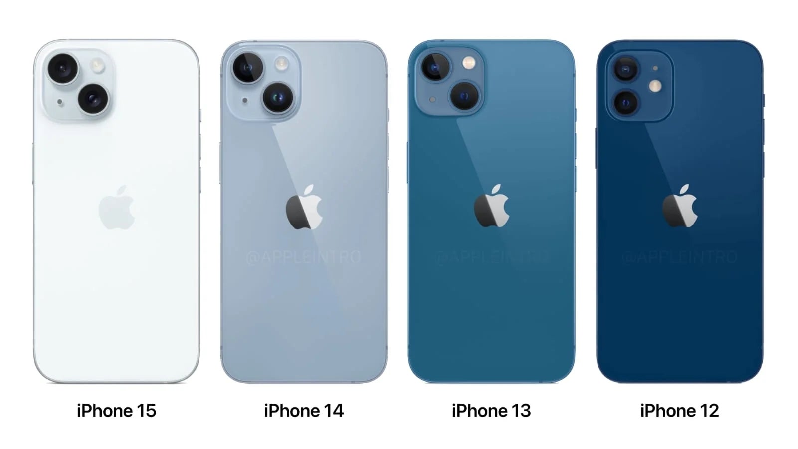

The green option isn’t my favorite shade of green either. The iPhone 13 green looked deeper and more sophisticated, while the iPhone 15’s “barely green” shade looks super fresh and minimal. Unless it looks white, which it often does.
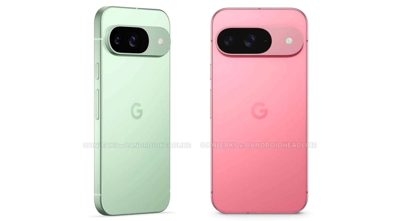

If the Pixel 9 looks like an iPhone, Google does colors better than Apple.
I mean… Just look at the green and pink Pixel 9 renders! That’s how you do it, Apple… Oh, and where’s the yellow iPhone 16?! And the red one?!
And orange… and purple… and… OK, I’ll stop now.
What about you? Do you care about the color of your iPhone, or do you just slap a case on it and forget about the color immediately?

