Hands-on iPhone 16 review: Two-minute preview
Apple‘s iPhone 16 is officially official, and returning are fun, vibrant colors, a redesigned camera bump on the rear, and a slew of new buttons. I’m on the ground in Cupertino, CA, and as Tim Cook closed out the “It’s Glowtime.” keynote, I dashed out of the Steve Jobs Theater and headed straight towards the iPhone 16.
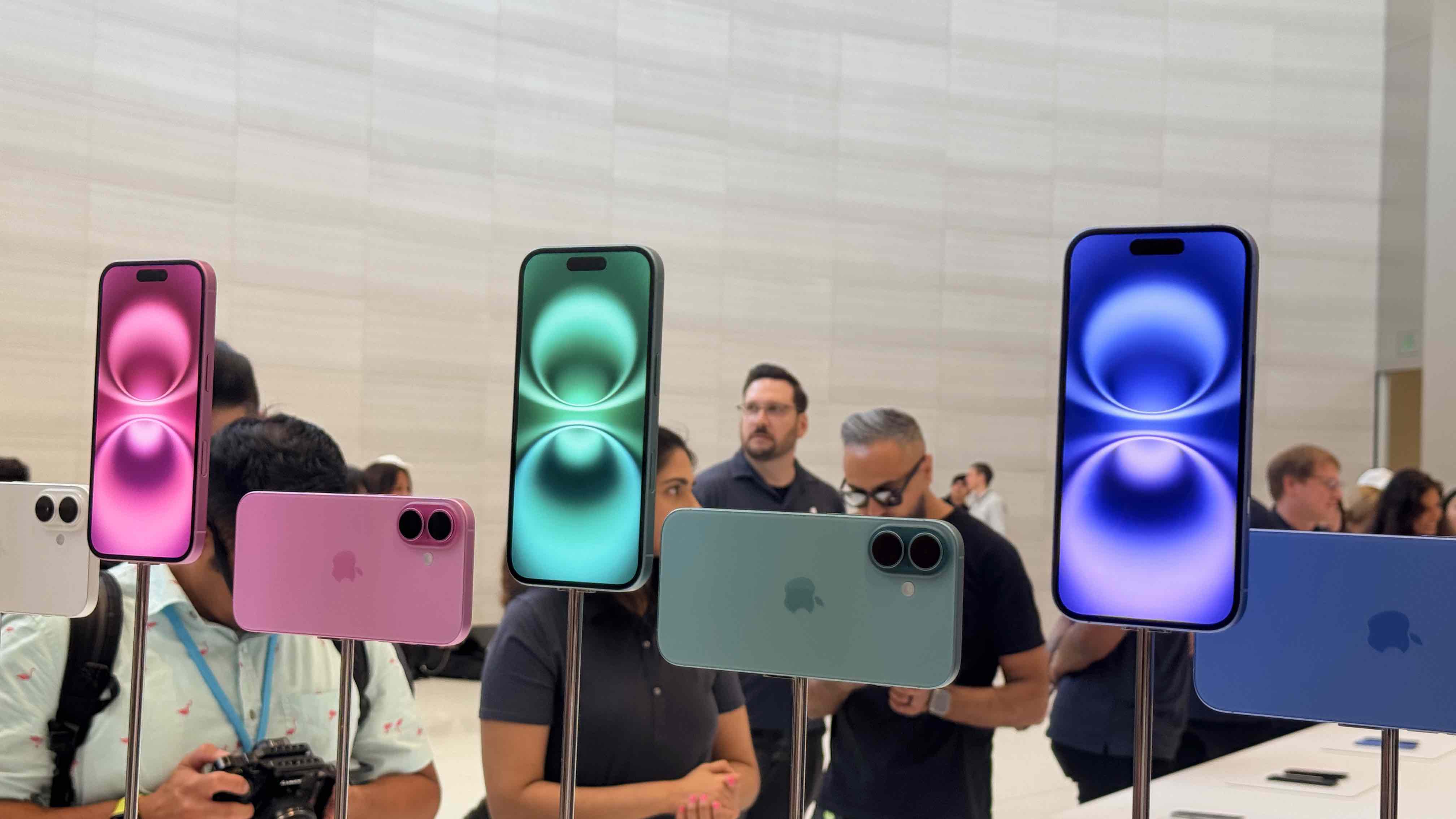
First, the colors are fantastic and best described simply as fun, at least for most shades. Ultra Marine (a mix of blues, but don’t call it blue), Pink, and Teal all come together to freshen up the iPhone palette and look delightful. I think Pro users will be a little upset with the vibrant shades here, though. You could say Black and White here resembles the more neutral shades that the Pros get.
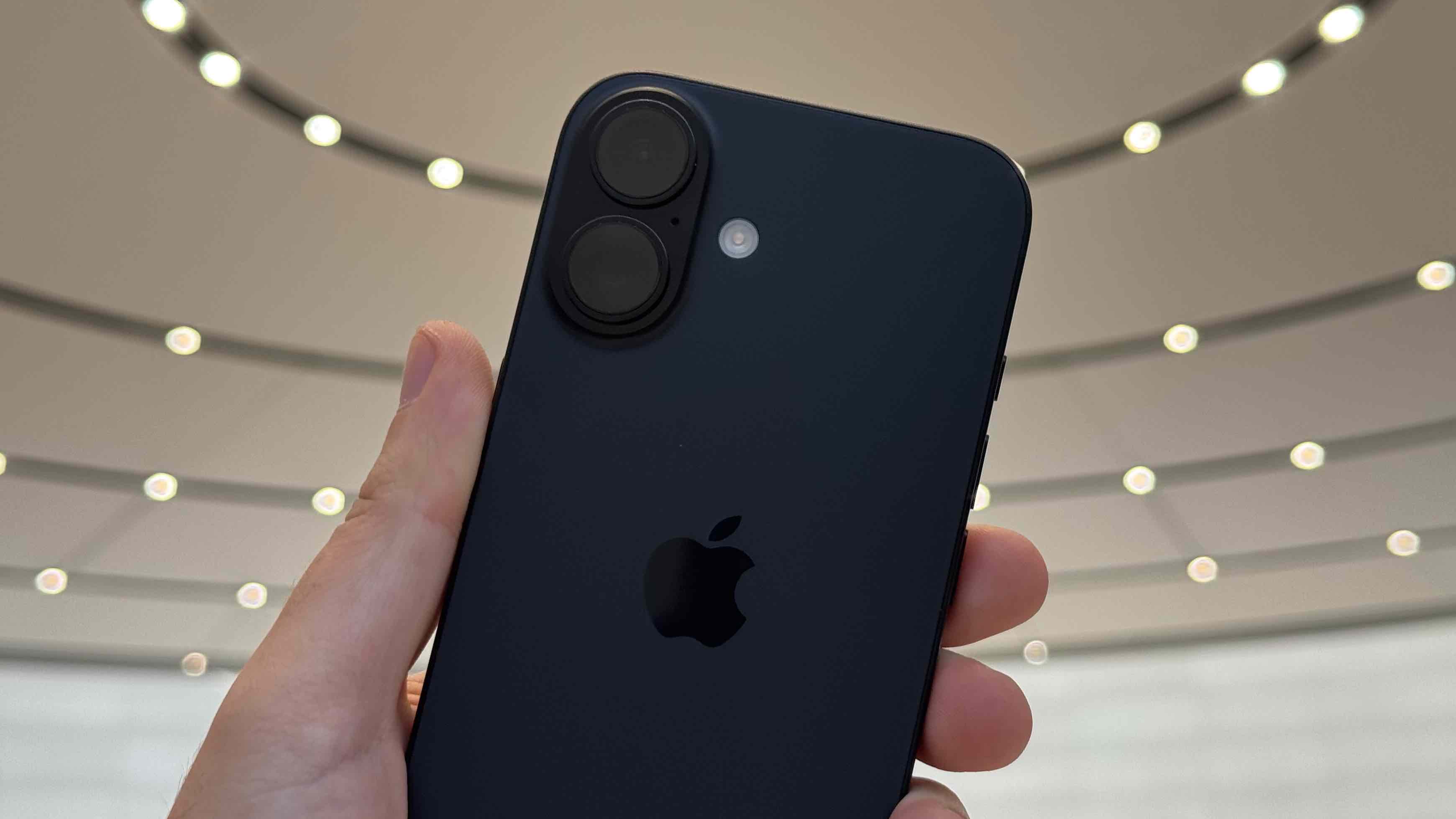
Regardless of shade, it’s most prominent on the back and is also the canvas for the redesigned main camera bump that sits vertically. It contains a 48-megapixel primary lens and a 12-megapixel ultrawide lens, and the new orientation will allow this iPhone to capture spatial video for playback on the Vision Pro.

The physical changes live on the sides, though – the Action Button has trickled down to the standard iPhones and lives above the volume rocker. I see it as a welcome addition, and much like the new customization features of iOS 18, it is a customizable button on your iPhone. You can be like me and use it to unlock your car, play a specific version of “Born to Run” by Bruce Springsteen, make a custom Shortcut to trigger, or pick from presets like turning on the flashlight or opening up the camera.
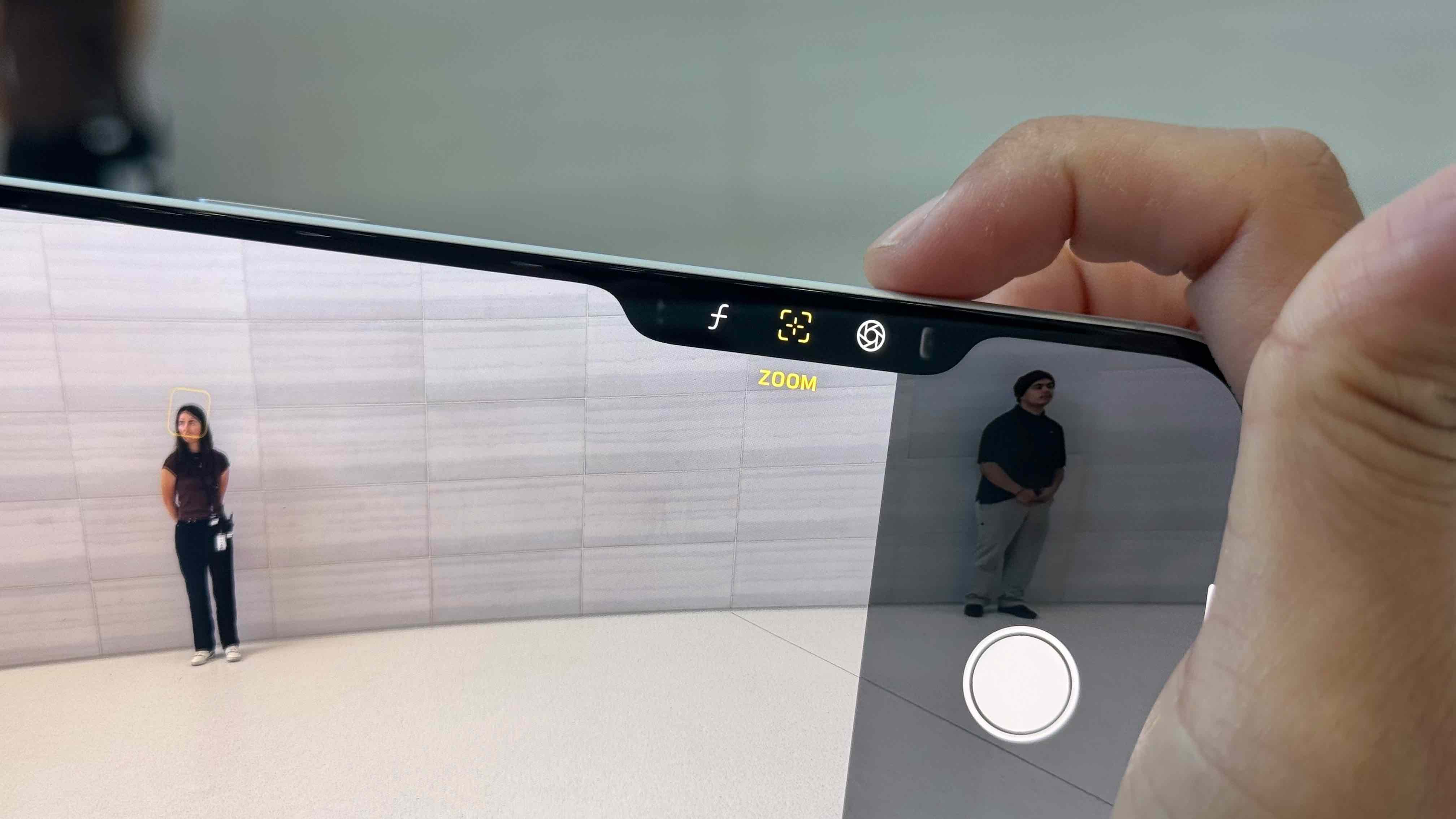
Though, I don’t know why you would set it to camera, considering the iPhone 16 has an all-new “Camera Control” button on the left. It’s in the perfect position, as when you’re holding the iPhone 16 horizontally, it’s on the top right, which mirrors the design of nearly any camera. You can click it once to open the camera and again to take the shot, but it’s a button filled with technology. You can swipe left or right to zoom in or out, and a slightly lighter press-in lets you jump between shooting modes and other effects. It’s really cool, and I cannot wait to spend more time with it.

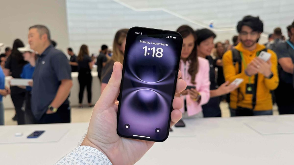
Aside from these changes, though, the iPhone 16 really resembles the iPhone 15 quite a bit. Thanks to an aluminum build, it still feels solid in the hand, but it won’t weigh you down. To the untrained eye, the front is nearly all display, at 6.1 inches, and the OLED is still vibrant and crisp with details. It’s still just 60Hz, so there is no buttery smooth refresh rate, but I imagine most folks will be split. If you have a phone with a 120Hz screen, it’s best to steer clear, but if you haven’t experienced it, I don’t think you’ll mind it all.
Plus, the Dynamic Island is on top, so you can use the Live Activities galore. During my brief hands-on time, the iPhone 16 felt snappy for opening applications, playing around with the new buttons, and even attempting a few games. There is also a new chip under the hood – yes, an entirely new one instead of Apple trickling the Pro’s one down – and it’s the Apple A18 chip, which can handle a lot. It will be plenty for daily tasks and will be ready to help you make the most of Apple Intelligence when those features arrive.
To address the proverbial elephant in the room, the iPhone 16 will come out of the box with iOS 18, meaning that no Apple Intelligence features will be available out of the box. The first of those features, Writing Tools and Photo Cleanup will arrive with iOS 18.1 in October.
That about sums up my first impressions of the iPhone 16 – it’s a powerful smartphone that should be zippy with some extra buttons in a similar, familiar build. I suspect the experience will be a lot like the iPhone 15, but I’m also curious to see how it steps things up, especially compared to earlier iPhones. At the minimum, these are way more colorful, which is something to celebrate.

Hands-on iPhone 16 review: Price and availability
- Starts at $799 / £799 / AU$1,399
- Pre-orders open on September 13, and shipping begins on September 20
The iPhone 16 was announced at Apple’s ‘It’s Glowtime’ event on Monday, September 9. iPhone 16 preorders will begin on Friday, September 9, and the new phone will hit store shelves on Friday, September 20.
The iPhone 16 starts at $799 / £799 / AU$1,399 for the model with 128GB of storage, with that price rising to $899 / £899 / AU$1,599 for the model with 256GB of storage and $1,099 / £1,099 / AU$1,949 for the model with 512GB of storage.
Full iPhone 16 pricing can be found below.
| Storage | US price | UK price | AU price |
|---|---|---|---|
| 128GB | $799 | £799 | AU$1,399 |
| 256GB | $899 | £899 | AU$1,599 |
| 512GB | $1,099 | £1,099 | AU$1,949 |
Hands-on iPhone 16 review: Specs
Below, you’ll find a roundup of the iPhone 16’s key specs.
| iPhone 16 | |
|---|---|
| Dimensions: | 147.6 x 71.6 x 7.8mm |
| Weight: | 170g |
| Display: | 6.1-inch OLED |
| Resolution: | 2556 x 1179 pixels |
| Refresh rate: | 60Hz |
| Chipset: | A18 |
| Rear cameras: | 48MP main (26 mm, ƒ/1.6), 12MP ultra-wide (13 mm, ƒ/2.2) |
| Front camera: | 12MP (ƒ/1.9) |
| Storage: | 128GB, 256GB, 512GB |

