The Danish bricks and narrow floor plan of this Aesop store in Copenhagen nod to the “humble” design of the nearby Louisiana Museum of Modern Art.
Located on Kronprinsensgade in Copenhagen’s old town, the neutral-hued store was created by skincare brand Aesop‘s in-house design team to complement its setting without “unnecessary flourishes”.
The interior takes cues from the architecture of the famed Louisiana Museum of Modern Art, completed in 1958 in Humlebæk, 35 kilometres north of Denmark’s capital.
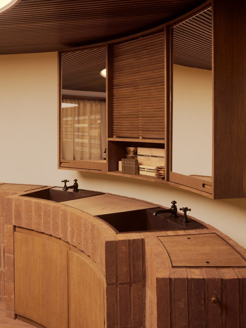
A long and low-ceilinged rectangular room makes up the store, which features a circular space at the back with a curved brick-clad basin.

This floor plan mirrors the museum’s “understated horizontal building” with its thin glass corridors, according to Aesop’s head of store design Marianne Lardilleux.
“We were drawn to the Louisiana Museum because it was designed as a home for Danish, rather than international, modern art,” she told Dezeen.

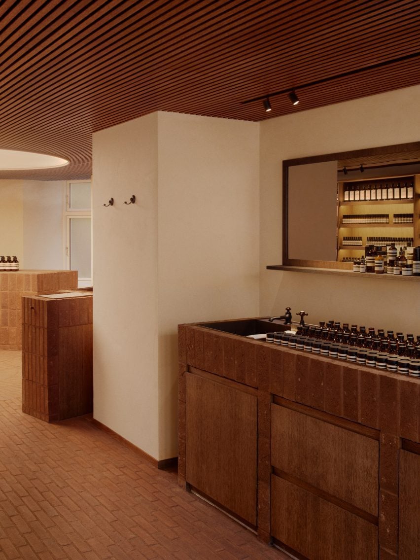
Danish red brick tiles were laid across the floor by local stonemasons, arranged in a “radiating” pattern that recalls several Copenhagen landmarks, according to Lardilleux. These bricks replaced the store’s original painted concrete screed flooring.
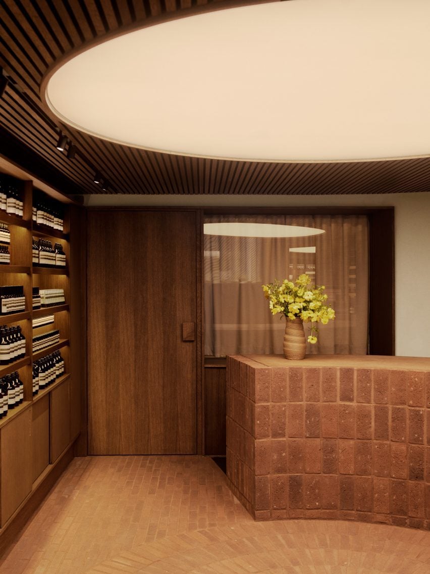
Stained oak timber was used to create sleek geometric shelving, which spans the length of one of the walls and provides a gallery-style display unit for neat rows of Aesop products.
This material was also applied to the ceiling, characterised by slatted wood interrupted only by an oversized and backlit circular opening above the brick-clad basin with aged brass elements.
A smooth timber door leads to the back-of-house area, concealed behind a sandy-coloured curtain.
“The focus is on the warmth of the materials,” explained Lardilleux.
“At the museum, the humble materials used – bricks, wood, white paint – come together in a way that is simple yet striking. At Aesop, we hope to design spaces that are similarly direct in their approach.”

“Just as every work of architecture relates to its site and context, every Aesop store is sensitive to its environment,” added the designer.
“We are not interested in rolling out identical interiors – our surroundings have always inspired us.”
Since the first Aesop outlet was designed in St Kilda, Melbourne, in 2003, the brand has opened hundreds of global stores that respond to their settings.
Recently, architect Jakob Sprenger installed 1920s plaster medallions above a sculptural sink as the centre of a Paris store while design studio Odami chose minty green interiors for a location in Los Angeles.
The images are courtesy of Brian Buchard.

